The store will not work correctly in the case when cookies are disabled.
Cookie Notice
Your privacy is important to us. We use cookies to enhance your browsing experience and analyse our traffic. By clicking 'Allow Cookies' you consent to our use of cookies. For more details or to adjust your preferences,click here.
These cookies are necessary for the website to work and cannot be turned off. They are usually set in response to your requests for services, such as personal data protection settings, filling in or unsubscribing forms. You can set your browser to reject cookies or notify you about them - but some parts of the site will not work then. These cookies do not store any information that can identify you.
These technologies allow us to analyse the use of the website in order to measure and improve performance.
These technologies are used by advertising parties to display ads relevant to your interests.
Get 10% OFF with the code new10 - we despatch within 48 hrs of PDF proof approval.
When label designing, you should always consider those that may have a disability. It’s an area that is often overlooked by small manufacturers, medium to large are often guilty too but awareness is growing.
It’s not just the moral obligations; economically there is a lot of purchasing power going to waste if you don’t cater for disabled people. It is perhaps easier to approach the concept of designing for inclusivity differently.
Often, we look at disability or a challenged capacity in specific situations as a rarity. What you may overlook is the portion of our target market that is lost by simply not considering a few minor changes or additions.
There is, of course, the knock-on effect, imagine that a colour blind adult can’t read or appreciate a label, they, therefore, don’t or won’t buy the product. Their colour sighted relatives in the home, are therefore not exposed to the product either and so the target market shrinks exponentially, yet it often only takes a bit of consideration and minor design changes to make everyone’s life a little easier.
If you outline accessibility needs from the beginning within your brand guidelines it will have a knock-on effect as your business starts to grow and flourish. You should take multiple things into consideration, this should include, but is not limited to, font, texture, braille, and readability.
Reality Check
In an ideal world, everything on a label would be large enough to be read by everyone and also in braille for severely sight impaired people but this isn’t possible in most cases, there simply isn’t room on the label. Different industries and applications need different labelling considerations so as a designer you need to prioritise different aspects of the design depending on the individual case. In general, identification would be the primary aim of a label but most of the rest would be industry-specific. Ingredients listing, nutritional information or instructions for use may be judged to be high on the list.
Remember you’re not doing people a favour here, we’re not simply conforming to official guidelines, it’s part of the sales process, you are expanding your customer base.
Labels for the Partially Sighted
While the term partially sighted seems fairly obvious it covers a range of conditions. The UK and US have slightly different criteria and terminology but both have a certification process that differentiates between severely sight impaired and sight impaired.
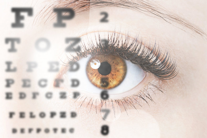
Sight impairment can mean a reduced field of vision or problems focusing on near or far objects or sight loss due to a dysfunction that obstructs vision like cataracts. Design considerations aside, the ideal remedy for this is a large font on a high-contrast background. It’s the obvious answer but not always possible, if you’re designing for a client your brief might not allow for something so plain but if you work on the basis that bolder is better then you are at least helping some people.
Outlines to lettering can also help in certain situations and since a primary goal of labelling is to catch the eye of everybody, this approach can only be a good thing.
Braille Labels
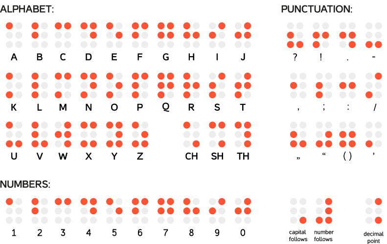
Braille is the series of small lumps that can be felt in specific patterns to denote a series of letters that most people are familiar with. Each character is represented as a pattern in a matrix of 3 rows of 2 columns and can be incorporated into labels, embossed into moulded bottles or have their own sticker.
Braille labels aren’t something that needs a whole lot of consideration; get as much information as you can into the space you have available. The braille alphabet is below, choose what you need to say and incorporate it into your label or bottle design.
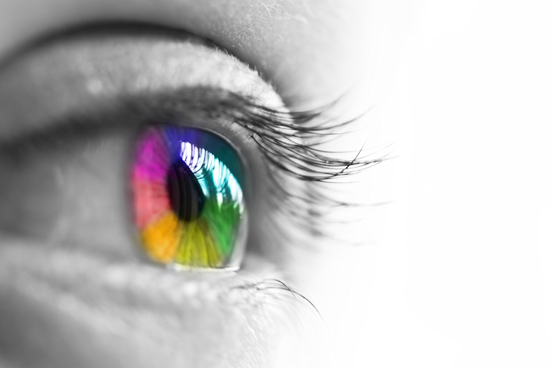
Colour Blindness
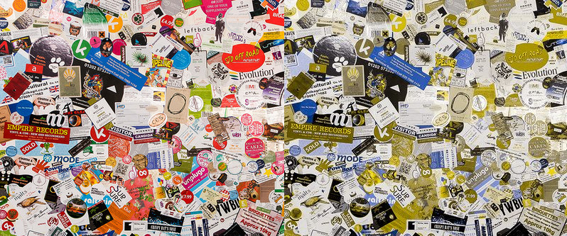
The majority of colour blind people don’t see in black, white and shades of grey, they see colours but often have difficulty differentiating between some of them. Red-green colourblindness is the most common, there are different types but the most common is Deuteranopia and the effects of this are seen below.
Normal view on the left and how a red/green colour blind person would see our custom stickers.
Approximately 8% of the male population globally is colour blind and half a per cent of women. The average person on the street may not consider this a disability; however, present a person with the most common form of colour blindness with a red message on a green background and it may present them with problems.
Some colour blind people are unaware and discover it when preparing for or during a coincidental test for things like a maritime examination or on the entrance to the military. A black border is a common solution to many problems to do with sight impairment so is always worth doing in all cases if it doesn’t reduce the effectiveness of the design too much.
There are several software applications available to check how an image or design would appear to a colour blind person and there are free applications online where you can upload an image to see how it would look to a colour deficient person. Color-blindness.com offer this service for free.
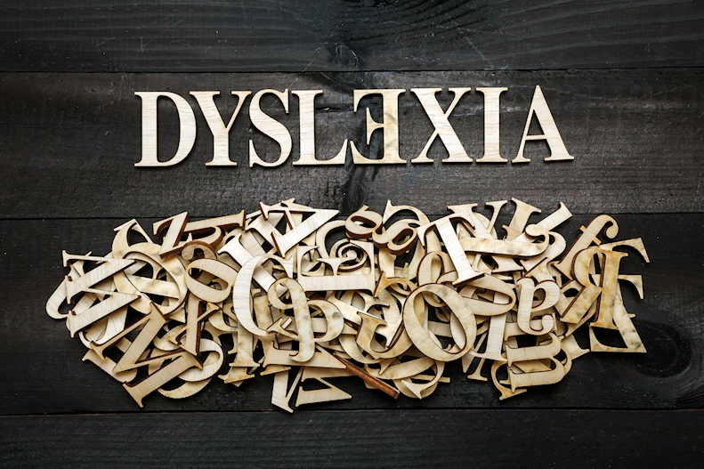
Dyslexia and Readability
Dyslexia is a difficulty with reading, spelling and pronunciation, sufferers, especially those with a milder form, often go undiagnosed. Some estimates put the incidence level at as high as 20% so a significant portion of your potential customer base could benefit from considerations in this area.
Avoiding complicated words with multiple syllables where possible along with technical jargon is often good advice in any case and the form of shorter words are often easier to remember or recognise for people who have any difficulty in this area.
Try to use words that relate directly to the image. Words with similar letter shape or easily turned around may not be appropriate. To create a brand impact simply placing the name and the logo or image together will suffice anyway. Designs that are cluttered with multiple images and design factors are more easily forgotten.
Accessible Fonts for Print
The font you use can also have a bearing, you may have some areas that are set like logos etc but a clear simple font used wherever possible will be a help.
Some great examples of accessible fonts for print are:
Tiresias - A font created and designed by the Royal National Institute for Blind People
Infofont - A variant of Tiresias that has been specially designed for labels and packaging
Read Regular - A typeface designed to help with word recognition
Other Serif Fonts including Arial, Calibri, Helvetica and Times New Roman
Much of the best practice for helping dyslexic people is similar to the advice for visually impaired people; clear font, large size, high contrast etc. Italics and underlining also cause problems, using bold for emphasis is better. Read Regular is a typeface that was designed to help with word recognition, other clear fonts like Arial and Trebuchet are good alternatives.
Physical Disabilities
The texture and surface of a label can also have an impact on people that have difficulties with their hands. While the size of the packaging clearly has an influence on the ability to pick something up, the label could determine whether a person can maintain a grip long enough to put it in the trolley. Simple considerations such as using a matt surface or creating texture on the label will make things easier in some cases.
While on their own each of these groups may seem to be too small a part of the market to have to cater for, when you place the total population that all these groups add up to, you could be unintentionally excluding a substantial number of people that a few simple changes to your label design strategy could capture. Imagine the extended captive market that your competitors have not considered.